![]()
![]()
![]()
![]()
![]()
![]()
![]()
Available elements
When clicking on ‘Add element in plot’ you have these different choices:
line
line / new file
scatter
scatter / new file
scatter CB
scatter CB / new file
histogram
histogram / new file
Error bars
Error bars / new file
Image
Image / new file
Band
Band / new image
Straight line
Span
Text
Line plots
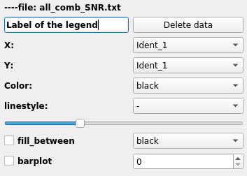
Line plot related widgets
The figure on the right shows the widget that will appear when you want to add a line plot.
The first line shows you the name of the loaded file for which you choosed to draw the scatter plot. On the second line, you have a text field (with ‘histogram number X’ by default). This is where you enter The delete button allows you to remove the scatterp lot from the plot and also all the associated widgets in the graphic element panel. The X: and Y: widgets ask for the column corresponding to the X and Y axis of your plot from your input catalog. The color widget makes you change the color of each points. The linestyle widget allows you to change the line style of your line (dot, dashed…). The slidebar allows one to change the tickness of the line. The fill between and associated color list choice will fill the space between your plot and the x-axis with the chosen color. The checkbox barplot will transform your line plot to a line-bar plot. Instead of creating line directly from the poin it will draw steps at each point. Finally, the spinbox with number allows you to smooth your line plot by a gaussian filter. The width of the gaussian filter is given by the number chosen in the spinbox.
Band plots
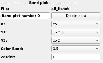
Band plot related widgets
The figure on the right shows the widget that will appear when y ou start a band plot. The first line shows you the file you use for this plot. The second line allows you to give the label of the plot (see below for details). The delete button allows you to remove the band plot from the plot and also all the associated widgets in the graphic element panel. Then you have to give X, Y1, Y2. Photon will create a plot filled with color between Y1 and Y2. The color Band widget allows you to select the filling color. Finally the zorder parameter allows you to choose how all the elements of the plot are pilled up (which one is on top of eachother).
Warning
It is worth mentionning that the fill_between method of matplotlib does not have a label argumnet. Therefore a line is created at the mean of Y1 and Y2 with the same color and same zorder as the band (it is therefore invisible). This label is assigned to this invisible line in the legend.
Scatter plots
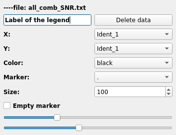
Scatter plot related widgets
The figure on the right shows the widget that will appear when you want to add scatter plot.
The first line shows you the name of the loaded file for which you choosed to draw the scatter plot. On the second line, you have a text field (with ‘histogram number X’ by default). This is where you enter The delete button allows you to remove the scatterp lot from the plot and also all the associated widgets in the graphic element panel. As previsouxly the X: and Y: ask for the column corresponding to the X and Y axis of your plot from your input catalog. The color widget makes you change the color of each points. The marker widget allows you to change the symbol you want to use for your scatter plot. The size spinbox will change the size of the symbols. The checkbox Empty Marker will remove the filling of the marker (e.g. filled circle –> empty circle).
Warning
If your symbols as only lines (e.g. crosses, ‘+’…) checking the ‘Empty Marker’ box will make your symbol disappear.
The two last slidebars make you control the tickness of the line drawing the marker and the transparency.
Scatter plots with colorbar
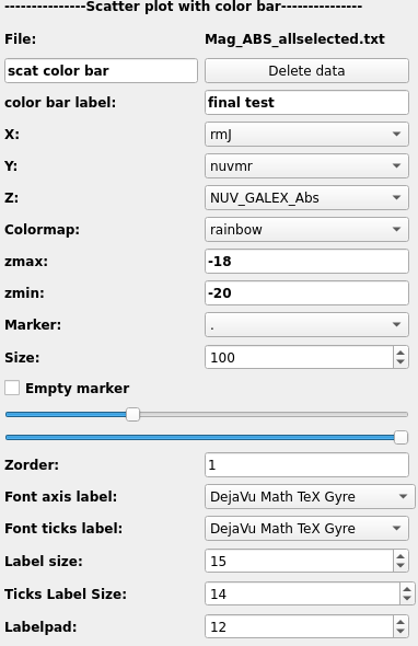
Scatter plot with color bar related widgets
The figure on the right shows the widget that will appear when you want to add scatter plot that includes a colorbar.
The first line shows you the name of the loaded file for which you choosed to draw the scatter plot. On the second line, you have a text field (with ‘scatter plot with color bar number X’ by default). This is where you enter the label of your plot for the legend. The delete button allows you to remove the scatterp lot from the plot and also all the associated widgets in the graphic element panel. Then you have the label for the color bar with color bar label. As previsouxly the X: and Y: ask for the column corresponding to the X and Y axis of your plot from your input catalog. Now you have a third column to give (Z) that corresponds to the data given by the color bar. The colorbar widget makes you change the color of each points. The vmin and vmax will give the opportunity to modify the limits of the color bar. The marker widget allows you to change the symbol you want to use for your scatter plot. The size spinbox will change the size of the symbols. The checkbox Empty Marker will remove the filling of the marker (e.g. filled circle –> empty circle).
Warning
If your symbols as only lines (e.g. crosses, ‘+’…) checking the ‘Empty Marker’ box will make your symbol disappear.
The two last slidebars make you control the tickness of the line drawing the marker and the transparency.
Then you have the zorder parameter that controls how the data are pilling up. And finally you have all the properties for the color bar itself. You can control the fonts of both the label of the colorbar and the tick label as well as their sizes. The labelpad allows you to move the colorbar label closer to the colorbar or awys from it.
Histogram plots
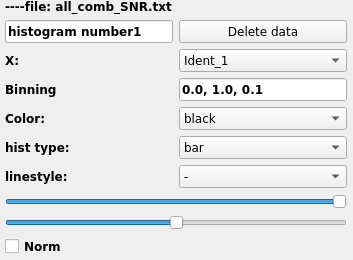
Histogram related widgets
The figure on the right shows the widget that will appear when you want to add an histogram plot.
The first line shows you the loaded file for which you choosed to draw the histogram. On the second line, you have a text field (with ‘histogram number X’ by default). This is where you enter the label of the histogram that will be displayed in the legend (can be left blank). As usual the delete button allows you to remove the histogram from the plot and also all the associated widgets in the graphic element panel.
Then, the ‘X:’ widget ask you to choose the column of the input catalog whom the histogram is drawn from. The Binning widget allows you to choose the binning of the histogram. It need 3 numbers in the format ‘xi, xf, dx’. Where ‘xi’ is the first bin, xf is the last one and dx the width of each bin. The color widget provides all the available colors. The histtype multiple choice widget let you choose between different histogram type (bars, steps, filledsteps…). If you choose the ‘steps’ style, it will just draw the contour of the histogram with a line. In that case you can choose the linestyle in the widget linestyle. Two slidebars are displayed after. The first controls the transparency of the histogram, and the second controls the tickness of the line. Finally, a check box norm allows one to normalise the histogram. It will recompute all the bins so the sum of all of them is equal to one.
Errorbar plots
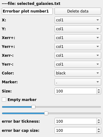
Errorbar plot related widgets
The figure on the right shows the widget that will appear when you want to add a plot with error bars. This kind of plot are basically equivalent to scatter plots but with some more information on how to plot the error bars
The first line shows you the name of the loaded file for which you choosed to draw the errorbar plot. On the second line, you have a text field (with ‘Errorbar plot number X’ by default). This is where you enter the label that will go into the legend of the plot. The delete button allows you to remove the errorbar plot from the plot and also all the associated widgets in the graphic element panel. As previsously the X: and Y: ask for the column corresponding to the X and Y axis of your plot from your input catalog.
Then, you have to give four columns for the error bars. As errors ccan be asymetric two values are need along X and two values are also needed along Y. Along X, you have to give the two errors with the widgets Xerr+ and Xerr-. ALong Y, you have to give the two errors with the widgets Yerr+ and Yerr-.
Then, you can choose the color (it will be the same for the marker and the errorbars) with the color widget. Additionaly you can set the size of the marker using the size spinbox. The empty marker checkbox allows you to transform your marker (e.g. circles, squares, pentagons…) into empty marker where just the contour is displayed (see the warning above when checking this option). The two last slidebars make you control the tickness of the line drawing the marker and the transparency. Finally you can control the tickness of the errorbars and the size of the errorbar cap using the spinboxes error bar tickness and error bar cap size.
Image plots
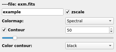
Image plot related widgets
The figure on the right shows the widget that will appear when you want to plot an image.
As usual the first line shows the name of the loaded file (name of your image). On the second line you have the legend label (‘image plot number1’) and you can change it freely. On the same line you have the zscale checkbox that allows you to display the image with the ds9-like zscale colormap levels.
On the next line you have the possibility of changing the colormap. The list depends shows all the colorbars contained in matplotlib.
The last 3 lines allows you to plot contours over the image. To use them you have to check the ‘Contour’ checkbox and provide a threshold level. The scrollbar allows you to change the linewidth of the contour and the last line provide a list of colors for the contour line.
Straight lines
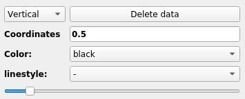
Straight line related widgets
The figure on the right shows the widget that will appear when you want to add straight lines.
The first widget is a multiple choice button where you can choose between vertical, horizontal and diagonal lines. As usual the delete button allows you to remove the strip from the plot and also all the associated widgets in the graphic element panel.
The widget coordinates require two or three numbers. If you choose between ‘horizontal’ and ‘vertical’ lines, three numbers will be required. For example, if you choose vertical, you will have to give the X-coodinate, and the y-coordinate indicating the limits of the line you want to draw. If you choose ‘diagonal’ it will draw the line x=y and you have to give the limits on the plot in the format ‘xmin, xmax’. The widget color allows you to choose the color you want. The widget linestyle change the linestyle of the line. And finally the slide bar will help you to change the tickness of the line.
Spans
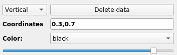
Spanning stripes related widgets
The figure on the right shows the widget that will appear when you want to add strips.
The first widget is a multiplt choice button where you can choose between vertical and horizontal stripes. As usual the delete button allows you to remove the strip from the plot and also all the associated widgets in the graphic element panel. Then the coordinate field (coming by default at ‘0.3, 0.7’) is where the limit of the stripes are going. The format must be (‘x1, x2’). Then the color widget allows one to change the color of the span. And finally the slide bar change the transparency of the strip.
Text
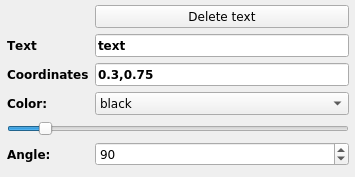
Text related widgets
The figure on the right shows the widget that will appear when you want to add text. As usual the delete button allows you to remove the text from the plot and also all the associated widgets in the graphic element panel.
The text field (coming with an ‘text’ entry) is where you write the text you want to display. It can use Latex font. Then the coordinates field (coming by default at ‘0.3, 0.7’) is where you must give the coordinates of the bottom left corner of the text. The format is ‘x,y’. Then, the slidebar allows you to play with the size of the text. Finally the angle (from 0 degree to 360) allows one to rotate the text.
Save a plot configuration
Once your plot is finalized you can save all the configuration by clicking on the button ‘save plot’ (at the top of the Grapical element panel). Doing so will create a configuration file containing all your graphical elements input. Later on you can use this configuration plot and load it back to photon using the ‘-p’ argument. It will load all the widget and you will be able to modify your plot from where you stopped. An example of such plot looks like this:
[Types]
line = 2
scatter = 1
error = 1
text = 0
segments = 1
image = 0
diag = 0
hist = 0
strip = 1
xmin = -1.4095964382872301
xmax = 17.594015772257148
ymin = -1.0603746193287176
ymax = 18.55164828289531
x_label = Xlabel
y_label = Ylabel

[line_1]
file = text.txt
label = Line plot number 1
zorder = 2
x = A
y = A
color = red
style = -
color_fb = 0.5
fb = No
bp = No
thickness = 30
smooth = 0

[line_2]
file = /media/sf_Documents/text2.txt
label = Line plot number 1
zorder = 1
x = A
y = B
color = black
style = --
color_fb = 0.5
fb = No
bp = No
thickness = 10
smooth = 0

[scat_1]
file = /media/sf_Documents/text2.txt
label = scatter plot number 1
zorder = 1
x = A
y = B
color = green
marker = D
empty = Yes
thickness = 10
transparency = 10
size = 100

[stra_1]
dir = Vertical
color = black
style = -
zorder = -1
thickness = 44
coor = 7, 1,8

[stri_1]
dir = Vertical
color = red
zorder = 0
transparency = 100
coor = 0.3, 0.7

[erro_1]
file = text.txt
label = error plot number 0
zorder = 2
x = A
y = A
xerrp = A
xerrm = A
yerrp = A
yerrm = A
color = black
marker = .
empty = Yes
transparency = 10
size = 15
barsize = 10
capsize = 50
Warning
It is strongly suggested not to modify this file. As photon reads it, it might have trouble to reload your configuration if the file was modified by hand .
Warning
As you might see, for each type of plot the donfiguration gives the name of the file to be used. It will write the full path of the file with respect to the directory where you started photon.